
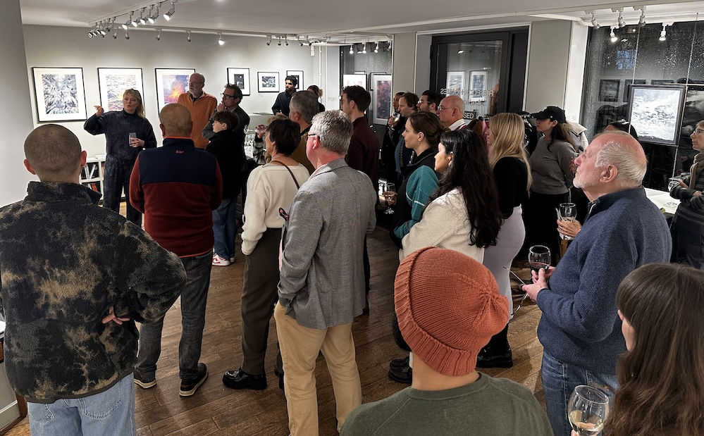
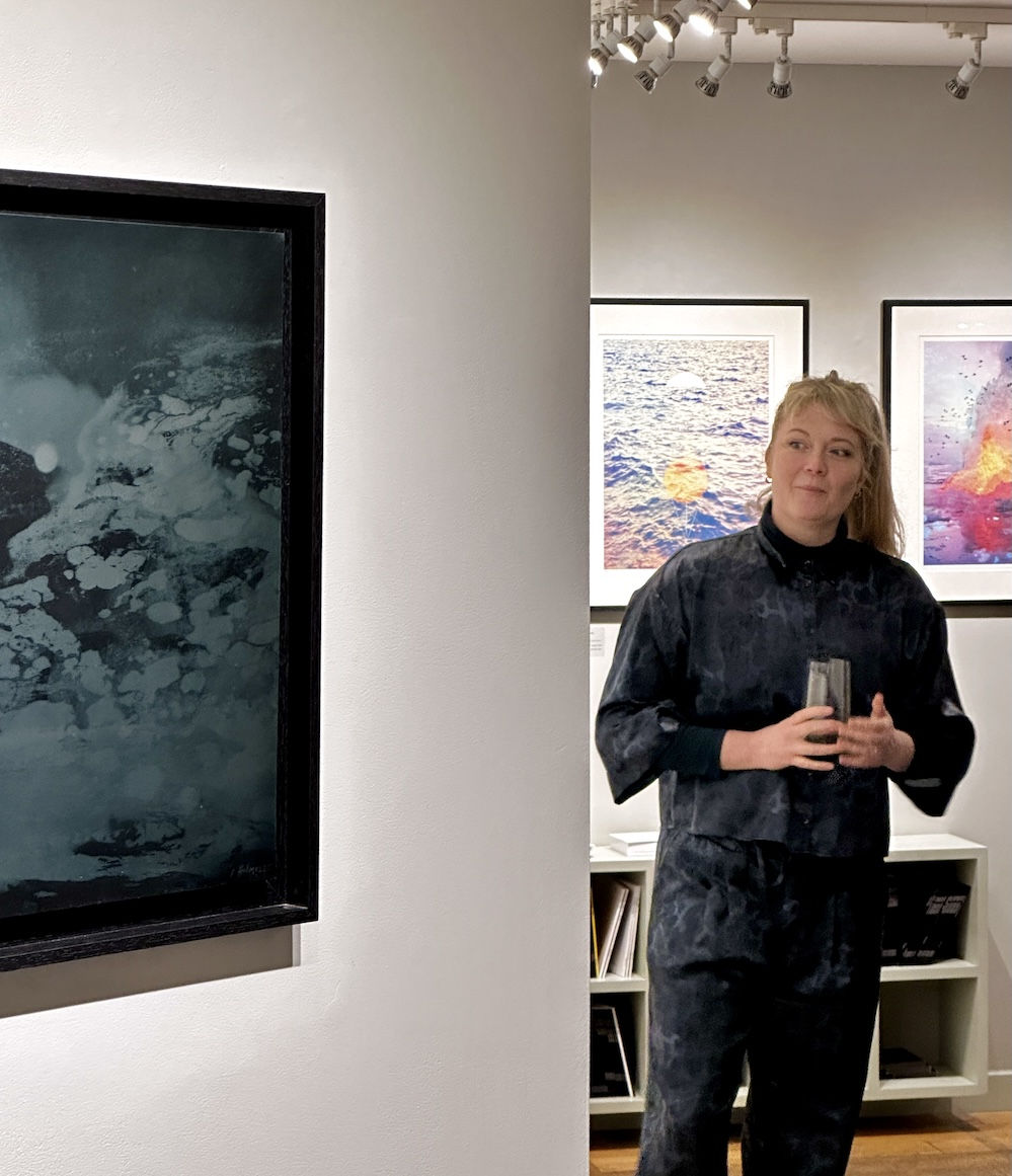
This transcript was taken from the end of Rebecca's talk at the Eames Fine Art Gallery - we have chosen to focus here on the parts of her talk which touched on her more experimental and latest prints.
VE: Let’s look at your CMYK prints because these are stunning, and quite different from much else in the exhibition. And yet we see your usual trademark of thoughtful yet playful exploration of the layering of marks and colours to build up images. You are using a special technique here again to pinpoint a very particular feel to these works and, and I think that's what sets these out as so popular within the show.

RH: Okay, with these three works I wanted to see if I could create images in full spectrum colour rather than the monochrome or limited palettes I’ve used in the other works in this show. And of course, I went way over that threshold: I didn't really want something that felt directly of this world, so I decided to go full Technicolor here.
Traditional CMYK printing was my starting point, but many artists that I admire have liked the idea of printing in this way but thought it could be done better by pushing the limits of the method: and many have gone on to explore this way of printmaking and achieved fantastic results, so I really wanted to test it out with my work too, to see if this was a plausible way to introduce colour into my work in a layering way that made sense to me.
VE: So, these are your CMYK works. And I'm afraid I'm going to have to ask you to explain for the uninitiated, what we're talking about here.
RH: CMYK prints are made by creating colour separations using just four colours: cyan, magenta, yellow and key (or black). And these colours all sit within a rosette. You'll often see this in newspapers as this is traditionally how colour was printed in tabloid papers. The separations are made up with these tiny dots of colour that sit next to and on top of each other, and when the dots overlap, they create the full colour spectrum.
So, with this method you can achieve any colour or shade you want with just four layers of printing… I mean, it's never really four layers… This one's 17. This one's 15, and I think this one's 14! But, with this layering of just four separate colours you're able to create all the colours you need or want.
Some people stick to a held law that states you must start with a certain colour and work in a specific order… and sometimes it's true. For example: never start with yellow. Really - Just don't do it. It's really hard and I learnt the hard way! But otherwise, it’s just fun to experiment with layering colours in different ways here.
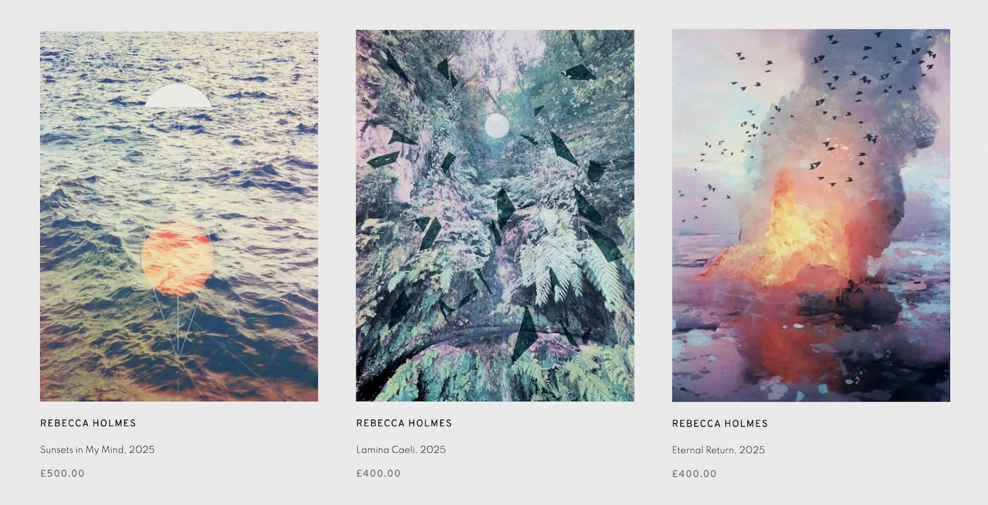
But of course with these images I didn’t just work in straight forward layers of colour – I worked over the films in many different ways to achieve the results I wanted – for example one of the layers here [Lamina Caeli] was achieved by painting onto clear film, similar to the clear film used for photopolymer printing but before I exposed it, I scratched into it and painted shapes over the images to create these tiny little drawings that are kind of whispered into the image – almost imperceptively, you have to look hard to see them.
And then on this one [Sunsets in My Mind] I used templates to cover certain areas just so that the layers that are underneath would remain protected, much like with etching. So, when I was making this I was definitely thinking with an etcher’s mind. I remember thinking “Well, if I just put some hard ground on that, then I could block and protect this area…" That was my thinking. I love combining all different printmaking techniques and lessons together to learn new ways of working.
Making these felt like play. Like serious play. It felt like there was a lot riding on them coming out right. While I was adding all these complex layers I had a voice in my head saying “How are you ever going to edition these – they’ll probably end up just being a tiny edition of five if I’m not careful."
I actually, eventually decided it should be a variable edition because I wanted it to change. I wanted the sunsets to vary. You can see that sometimes there are small differences and in others the colours completely change. And that was a really wonderful time in the studio for me. Over those couple of weeks these images were constantly evolving, and every work was like a new artwork.
But it was fun and I really enjoyed it.
Finally, you can see with this one, Eternal Return, which was the last in this series, that I’m using so many different ways to make marks. I’ve got all these textures and new printing methods working together and I feel that I’ve learnt how to build layer by layer effectively. So, by this point, I felt like I'd really nailed the process and I was ever so pleased that I also landed on an image that I felt so happy with. I feel like everything came together really well with this work – I’m very happy with it.
VE: Yes it’s a fantastic work and a great printing accomplishment, and it sounds as though it was also a bit of a high wire act getting to it.... I love the fact that you're flirting with disaster with these images and this process. But again, that strikes me as something that really motivates you to make these adventurous works of art.
RH: Yes, I never used to feel like this. Printmaking used to feel like a little safe place for me to work, like, "I'll do this this way – a tried and tested method of working - and everything will be fine." But these CMYK works are really kind of hard - much harder to do. A bit riskier. But for this exhibition I really wanted to push myself more and more and I’m very glad I did.
VE: You mentioned Technicolor, is there something about the palette which is like an old Technicolor film? Because they do feel that they are of an era and they certainly seem to root the works within a specific sort of aesthetic.
RH: Yes, exactly – I hope that these works feel like they are a vision of the future from the past.
Or at least they certainly hark back to an era: back when we thought the future was going be amazing! When we were like, "Oh my goodness, the flying cars are going to be great." And now here we are in that future – and the flying cars are all just here on our screens!
VE: Absolutely, and these feel very different from our contemporary world and everyday experience of digital colour.
RH: Yes, for sure, this is a different kind of, visual experience. Like Future Retro, you know? and I'm seeing that from my teaching of printmaking, that courses in this technique and achieving similar imagined nostalgic images are becoming way more popular recently.
But actually, printmaking courses in general seem to be far more popular these days I’m happy to say. I think it’s because people want to learn actual techniques, they want to do things: they want to create things with their hands, and they want to surround themselves with true, handmade, beautiful things. I think you can tell when something is handmade, and already I think people can spot AI anywhere, it's kind of like the uncanny valley thing. It doesn't quite sit right. You can’t build fake landscapes out of geometric shapes – it needs a human eye to understand the beauty in leaf patterns, fractals, and the harmony and beauty of nature. That’s what draws me back time and again to these images.
VE: Just before we finish, I wanted to ask you about something you mentioned when talking to us about the sculpture in this show – it’s wonderful but you did also mention that you were making a larger and perhaps even more adventurous version of the sculpture?
RH: Oh, yes. So I've made a larger sculpture already – ready to etch onto. I found out that you can kind of etch steel using salt and that got me thinking that I could take it back to the landscape using this idea. So, I'd like to make a piece of interactive video art. I’d like to try to etch the steel sculpture in the sea. It might just be a mad idea. And now I'm hearing it out loud, I'm like, "Don't do it!"
But I’m so excited to try it that I probably will – you see the metal doesn’t etch in the usual way, but instead the salt kind of oxidizes it which removes the metal in a similar way to etching with acid.
I plan to do the mark making on the steel sculpture – as if it was a steel etching plate - in exactly the same way as I did with the smaller one: using stop out varnish and even some of my hairs to paint it on it with (I had to do this because I needed very fine lines which require a very fine brush, which I didn't have, so looking around I used what was to hand ... I used my hair!)

So, I plan to paint it with the stop out – where I don’t want the steel to erode - and then find some clever way of perhaps magnetically attaching the sculpture to some rocks ... and let the sea go at it. And the idea is that I want the landscape to affect it. Not just take from the landscape, but for it to become part of it again. So that it isn’t just a representation of a landscape, but it is actually a part of that landscape now.
I love the way the process also becomes an event, I would say nature is an event. It's not a static thing. And that feels like something that would fit with my aesthetic: it feels good for me, I’m very excited about what is coming next.
View the works from this exhibition online HERE
