-
Unique Prints with Hand Painting
-
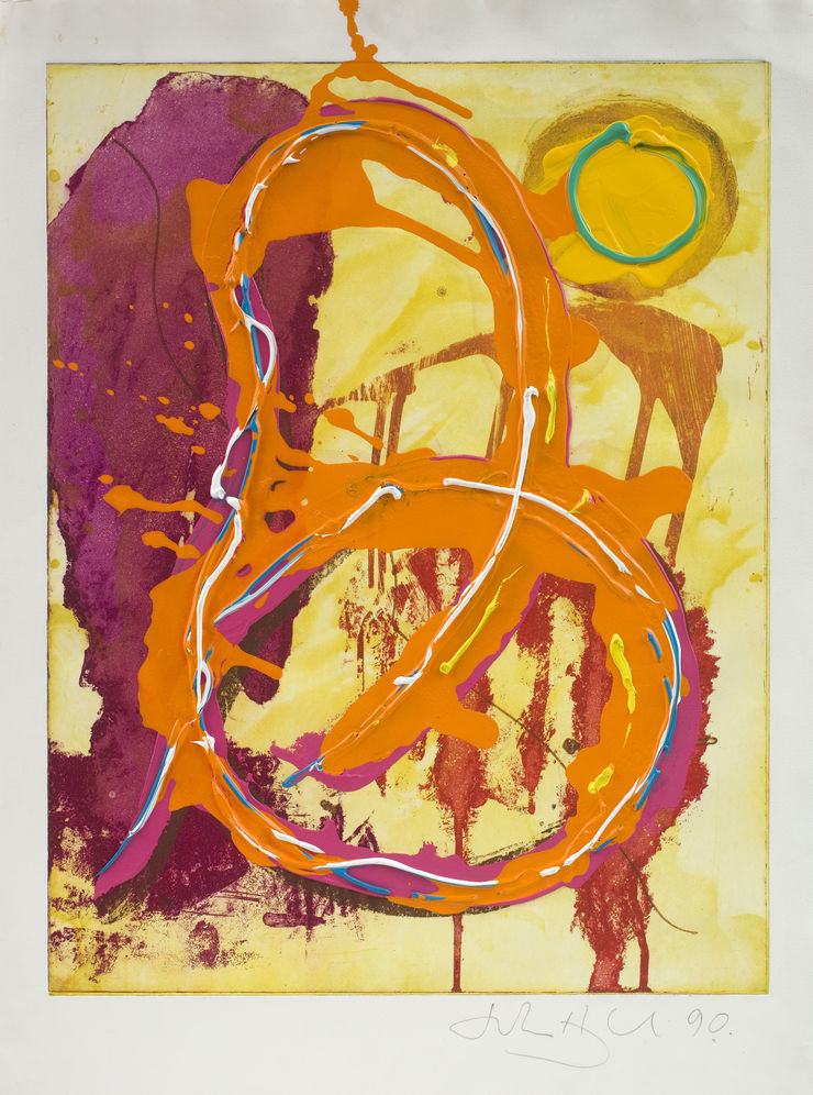
 John HoylandUntitled (Banda Oriental), 1990£10,000.00
 -
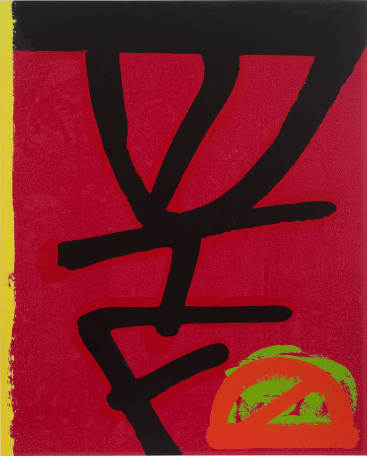
John HoylandUntitled , 1990Sold
-
John HoylandUntitled (Quas), c.1988£10,000.00
-
John HoylandUntitled, 1990£14,000.00
-
John HoylandUntitled, 1990£14,500.00
-
John HoylandUntitled, 1993Sold
-
John HoylandUntitled, 1993Sold
-
John HoylandUntitled, 1990Sold
-
-
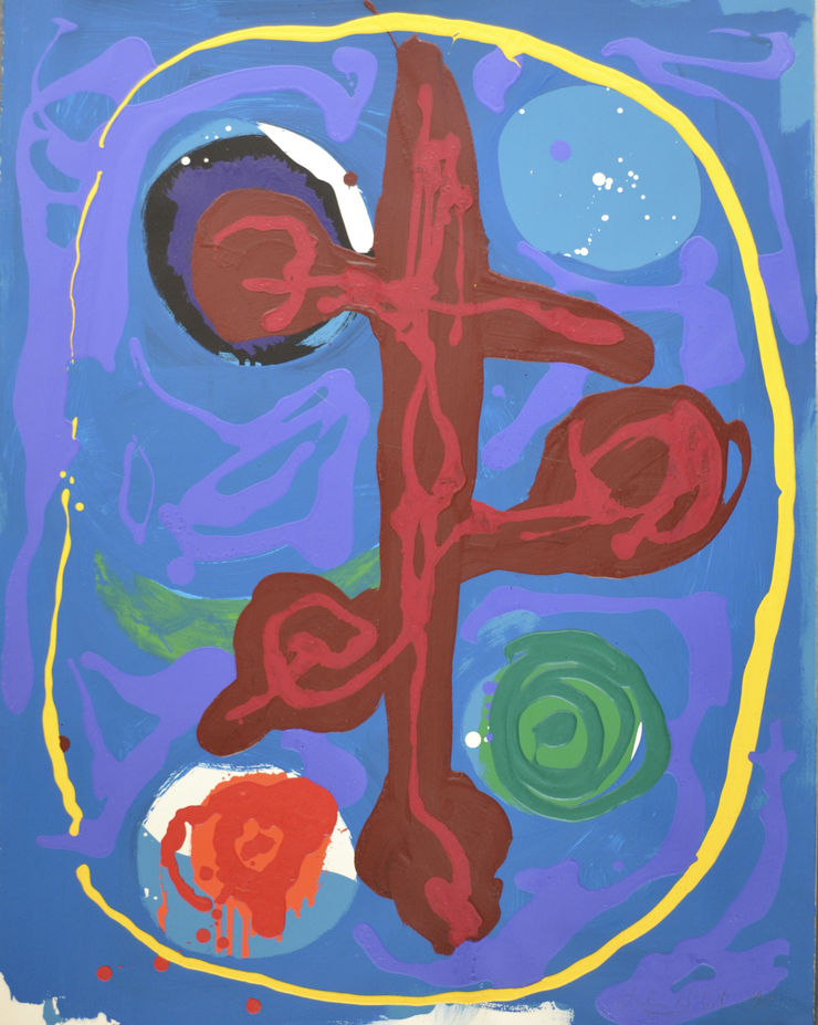
Monotypes
-
Edward Twohig on Etching with John Hoyland
'My association with John Hoyland began when I was a post-graduate student at Chelsea College of Art, in November 1990, and I was asked to assist with printing up four plates he had originally created in Italy. I was handed his steel etching plates and was immediately entranced by the many seemingly organic layers of gorged and pitted surfaces on the plate. After I had proof-printed each plate, I met with John to discuss the nuances of creating multiples for an edition. I had already detected my tutors’ reverence and esteem for John, and it was clear to see why: he was very serious but also approachable and generous with his explanations about the mechanics of printmaking.
I relished this exchange as John marvelled in each of the processes involved in making the print. I remember we talked at length about all aspects of preparation including the viscosity of the coloured inks used, wiping the ‘skin’ left on the surface of the metal, the starched gauzes employed in the wiping, the level of dampness of the paper, the pressure of the rollers on the press and even the thickness of the blankets. All this so that the visceral power of the image is liberated and celebrated to its best possible outcome.
Two months after completing our first edition, John arranged for the Print Studio at Manresa Road to be opened for us at the weekend so that we could work together on what he described as a ‘very tricky plate’. We were delighted that we got it right on the third go of printing it. I remember it was then that John quoted to me the words of an earlier visionary printmaker, Samuel Palmer: ‘The excitement of gambling without the guilt of its ruin’ to describe that moment when a plate has gone through the press and the impression has been transferred onto paper. On another occasion John offered this maxim: ‘Don’t let modern life swamp you, make the time to create every day. It’s easier said’.
Little did I know then that this exchange and these experiences would be intrinsic to my own printmaking career. John’s life’s work is a sustained, regenerative creation where passion and precision, head and heart go hand-in-hand. I believe that John Hoyland is on a par with Victor Pasmore and David Hockney, as the trio of master painter-printmakers who forged and extended intaglio chapters across the latter half of 20th-century British visual creativity.'
-
Etchings
-
Nigel Oxley on Etching with John Hoyland
'My first meeting with John was the most memorable of any that I had with an artist. I was introduced to John and after the initial discussion, John handed me the sheet of paper that he had been holding with the suggestion that we could use it for the prints. I took it and put a corner of it in my mouth and gently sucked it to which John said ‘I am not working with a fucking paper pervert!’ I quickly explained that I was moistening it to see if it was waterleaf or sized. I showed him the limp corner saying it would not survive the damping necessary for printing an etching and instead we would use Velin Arches. I knew from that moment that we would get on.
It was clear that handing John an etching needle would not create the graphic equivalent of his paintings. In preparation for working together I decided to etch a small plate where all the marks were made with brushes - I had a small catalogue image of his that I loosely based the plate on. This became the most complex and comprehensively bitten plate that I ever made - I still have my notes and proofs. When John arrived for his first day in the studio I showed him the proofs. He said he liked them and on a much larger plate we began what was to become his version. This first plate took several days and comprised multiple aquatints over open bites and many sugar-lifts as per my demonstration plate. When he declared it finished and proofed, John told me that he liked it as it now looked better than mine. He then looked at me and quickly said, ‘Yours is very good also but smaller’. This remark was the first indication of his generosity, politeness and real care that he showed to others. However, he added that he really disliked sugar-lift as it didn’t have the variety and character that a brush loaded with paint and pulled across a canvas gave him. As a result, he didn’t want the plate to be editioned. This was a major setback and I asked him to let me have a rethink.
I remember not sleeping well that night, but by morning I had a solution. Essentially John’s paintings were a build-up of multiple layers of gesture as the image gradually found itself. I couldn’t make a commercially viable etching as complex as that but it was possible to create a graphic equivalent. The solution was to use three plates: the first an aquatint to provide a background colour and then two plates of shapes that would define and qualify the image. I described this over the phone and he agreed that it sounded more interesting. We used this plate format for all twenty-one images that followed over the next four years and he became so comfortable with this process that his plate work became as natural as painting.
I still consider the etchings we made together to be incomparable. There were none like them at the time, and none since. They also include the first examples of the use of carborundum by an artist of his calibre in an English studio.'
-
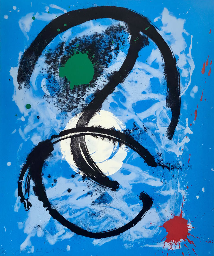
Kip Gresham on Screenprinting with John Hoyland
'Our first prints together were Root and Wandering Moon made in 1992. At the time I was co-director of Curwen Chilford Prints, Ltd., based just outside Cambridge. I had just set up a small publishing venture called CC editions and these prints with John were among the very first that it released.
Unlike most artists, John brought no sketches, designs or structures on which to base the new pieces. However, it quickly became clear that he had a full, current vocabulary to call upon. John was easy to work with; he listened very attentively and explained his objectives clearly.
Because colour prints of this sort are made in separate elements, or ‘separations’, and the artwork is all made in black, a lot of forward thinking and a capacity to envisage the final outcome is required. John knew where he was going but was also receptive to technical suggestion. That’s how collaborative printmaking works.
John quickly painted the main figure for Root with a medium-sized brush and then augmented this with dusted pigment. These are the red elements of the image. Separate drawings were made for the pink, white, yellow and green. Once all the stencils had been made from his drawings, the proofing commenced, and with this, a whole range of possibilities were ours to explore.
Because we were working on Arches Noir paper - a black sheet with a tough surface - all the colours were under printed in white and then over printed several times in colour. The transparent red required three printings to achieve the necessary saturation. The interplay between the stained-glass quality of the red and the more impasto feel of the opaque colours is a very interesting dialogue.
With Wandering Moon the separations were made the same way. The whole sheet was printed with two layers of blue and then the first semi-transparent white washes were laid down. The opaque white amplifies the quality of the softer white underneath. Layers of white were applied under the green and red to enhance their clarity. The experimentation involved in these two pieces then went on to inform Twin Peaks, Space Cowboy I and Space Cowboy II. Twin Peaks is very unusual in John’s body of prints because the base colour is a softly graduated blend, which introduces a kind of illusory space.
John is, above all, a master of colour: the reactions that one colour or tone can evoke in another is at the heart of all his work. Being up close and personal when such things are going on is a real privilege and the intimacy is very special. Although all this action took place nearly 30 years ago, it is still very alive in my mind, and I treasure the memories.'
-
Silkscreen Prints
-
John HoylandWandering Moon, 1992£2,400.00
-
John HoylandRoot, 1992£2,800.00
-
John HoylandTwin Peaks, 1992Sold
-
John HoylandSpace Cowboy II, 1992£950.00
-
John HoylandSpace Cowboy, 1992£950.00
-
John HoylandWandering Moon, 1993Framed£2,300.00
-
John HoylandSpace Borne, 1993£1,800.00
-
John HoylandKing's Seal, 1993Sold
-
John HoylandFound Seal , 1993Sold
-
John HoylandSky Warrior, 1993£1,800.00
-
John HoylandThupelo Seal, 1993£1,800.00
-
John HoylandSanur Seal, 1995Sold
-
John HoylandHating and Dreaming, 1990£3,500.00
-
John HoylandBlue Snake, 1993Sold
-
John HoylandWonderer, 1995£1,500.00
-
-
Wiz Patterson Kelly on John Hoyland's Printmaking
‘Shields, masks, tools, artifacts, mirrors, Avebury Circle, swimming underwater, snorkelling, views from planes, volcanoes, mountains, waterfalls, rocks, graffiti, stains, damp walls, pavements, puddles, the cosmos inside the human body, food, drinks, being drunk, sex, music, dancing, relentless rhythm, the Caribbean, the tropical light, the northern light, the oceanic light…’
A list of influences on Hoyland’s paintings, first given at a talk at the Tate in the 1980s.
Relentless Rhythm marks the 10th anniversary of John Hoyland’s death. In the absence of the artist himself, it is up to others to explore his legacy, to re-present the work of someone who had such drive and such passion for over five decades. In observing his entire oeuvre, one discovers that his exploration of media was more diverse than is widely known. A ‘painter’s painter’ with an intense physical engagement with the medium, he also created a theatre set and costumes for the Ballet Rambert, a mosaic mural for the Rome Metro, ceramics and glass sculpture in Italy. But these activities were fairly isolated in comparison to his printmaking, which became an activity deeply entwined with his painting practice, a constant running throughout his career.
Printmaking was a liberation from his constant ‘open season’ battle with painting. The pressure of time, studio expense, the constraints of process and the necessity of working collaboratively prevented painterly procrastination, and freed him to think in a very different way about what he wanted from a completed work. We can imagine his works evolving, starting under the clarity of his initial vision, but then guided by the incidents and accidents of the printing process.
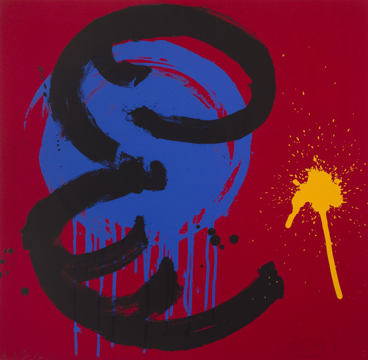
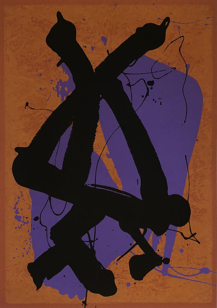
His first mature prints date from 1964, the year of his first solo exhibition. A few years later he made lithographs under Wolfensberger in Zurich and then at Kelpra Studios, London. Previously he had made small figurative etchings as a student at Sheffield College of Art and the Royal Academy Schools. His approach to printmaking was unorthodox and at times surprising for the master printmakers he worked with. He would reject convention and push the effects he could gain through spontaneous invention, seeking a more layered and overtly painterly surface. A period of exploring the etching process using brushed carborundum and aquatint followed in the 70s and into the 80s with works such as Quas (1986) and Mirage (1986), both made with Nigel Oxley at Kelpra Studio.
From the beginning Hoyland’s prints were clear and incisive, deceptively simple. His ability to make the transition between scale and medium without losing the depth of architectural form and interplay of colour was remarkable. As he gained a better grasp of printmaking techniques, he became increasingly brave, attempting more challenging and dramatic images, with wildly varying textures. This confidence allowed for a bold flowing gestural surface more akin to his paintings and seen clearly in Root (1992) and Wandering Moon (1992).
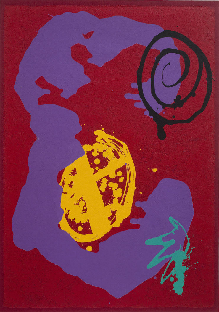
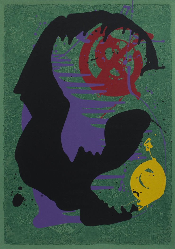
The Italian Etchings, such as Rivers of Surprise and Banda Oriental in 1989, were made with Grafica Uno in Milan, under the traditional maestro printmaker Giorgio Upiglio. Across the series, dreamy, ghostly shapes emerge from smoky layers. Aquatint mimics the subtlety of watercolour, contrasting with the gritty etched ground. The effect is Turneresque despite the obvious difference of artistic intent. From the 1980s onwards, Hoyland became increasingly keen to take inspiration from the wider world. His scrapbooks juxtapose tourist postcards from Jamaica, or paintings by his hero Vincent van Gogh, with magazine images of viruses under the microscope, distant nebula, exotic flowers, a parrot’s eye. He began to take Polaroids on his extensive travels, his colour palette changing to reflect the visual feasts on offer in Bali or Jamaica. However the photos Hoyland took were just as likely to feature cracks in the pavement of a grey city street (Twin Peaks, 1992) or graffiti on a Barcelona wall (Sanur Seal, 1995) or a London tube train (Wonderer, 1995) as lush tropical flora. His keen eye could see the expressive potential in a piece of string on the studio floor (Hating and Dreaming, 1990) or find a curious figure-like form in an incidental paint splash. Vibrant acrylic overpainted prints and monotypes from the early 90s show a strong desire to exploit chance, a hunger to take the forms observed in everyday life and reform them as emotionally charged works. His unique painterly vision drew on the uncanny, the something and yet nothing in the back of your mind, which allows the work to be in a constant state of becoming. Hoyland’s ability to find the beauty and force in the everyday will open the eyes of audiences for generations to come. The experiences of the human condition do not age or expire but are timeless.
- Wiz Patterson Kelly, John Hoyland Estate
-
Polaroids taken by John Hoyland as studies and inspiration for artworks
Courtesy of the John Hoyland Estate -
At a Glance in the Gallery | John Hoyland: Relentless Rhythm
Relentless Rhythm | John Hoyland Prints from the 80s and 90s
Past viewing_room