The Art We Hang at Home | The Team

A glimpse at the artworks staff from Eames Fine Art have chosen for their walls at home.
March 26, 2020
The Art We Hang at Home | The Team

We thought it would be interesting for us to show each other a few of the pictures we have on our own walls.  Here are a few snaps that staff at Eames Fine Art have each taken in our homes in the past few days: just a selection of some of our favourite artworks hung at home.


Rebecca and Vincent Eames


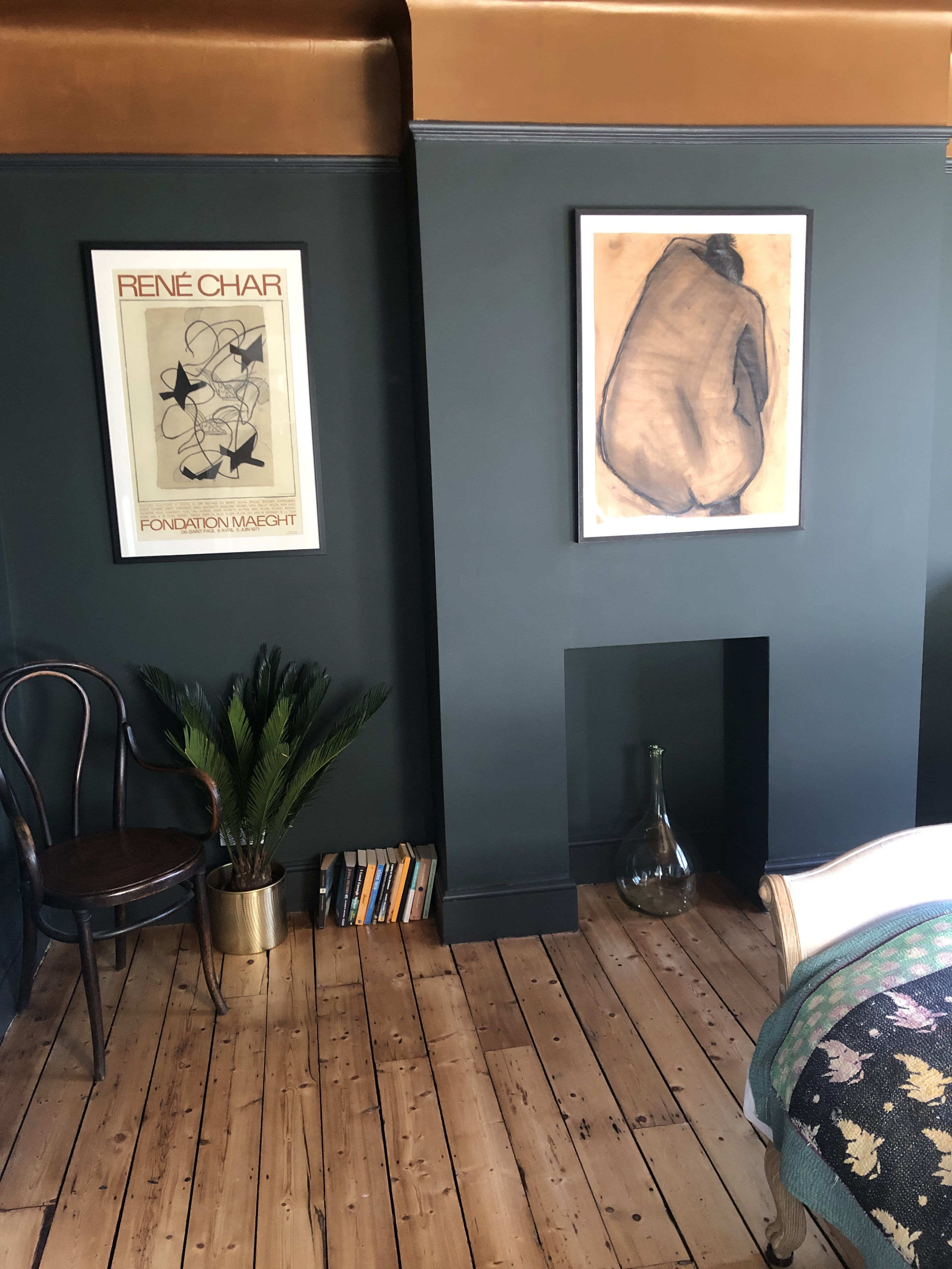
We moved into a new house last year, and have only managed to decorate a few rooms so far, but our favourite and most adventurous has been our bedroom - we went for a beautiful dark green paint on the walls and a crazy copper coloured ceiling which gives the room a beautiful warm glow! It works perfectly with some of our favourite works.  These are the first pictures we see in the morning and the last we see at night - they give me so much pleasure - a charcoal drawing by Nigel Swift and an original Georges Braque poster.  We also have another work by Nigel alongside a lithograph by Matisse and an etching by Ross Loveday in the room, they all give us a feeling of serenity and calm. 

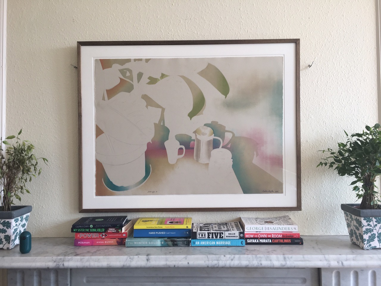
(Also in the main picture, of our living room, we've hung a Picasso linocut next to a rather unusual work by Victor Vasarely and a beautiful etching by Amanda Danicic.)


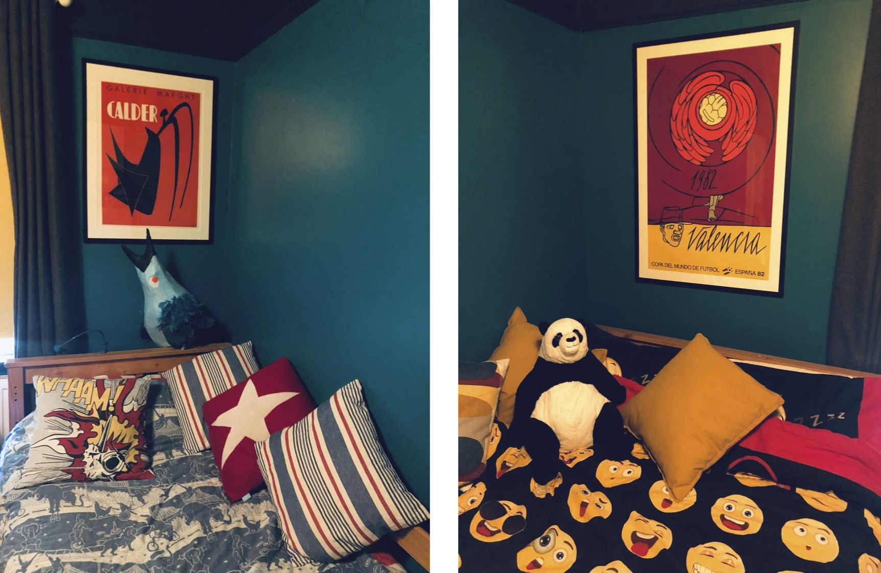
Our two sons share a bedroom. We've gone for a dark turquoise for their walls - everything in their room is bright and loud so we chose these brilliant works by Adami and Calder which the boys love - especially since the Adami is a football poster - win/win!


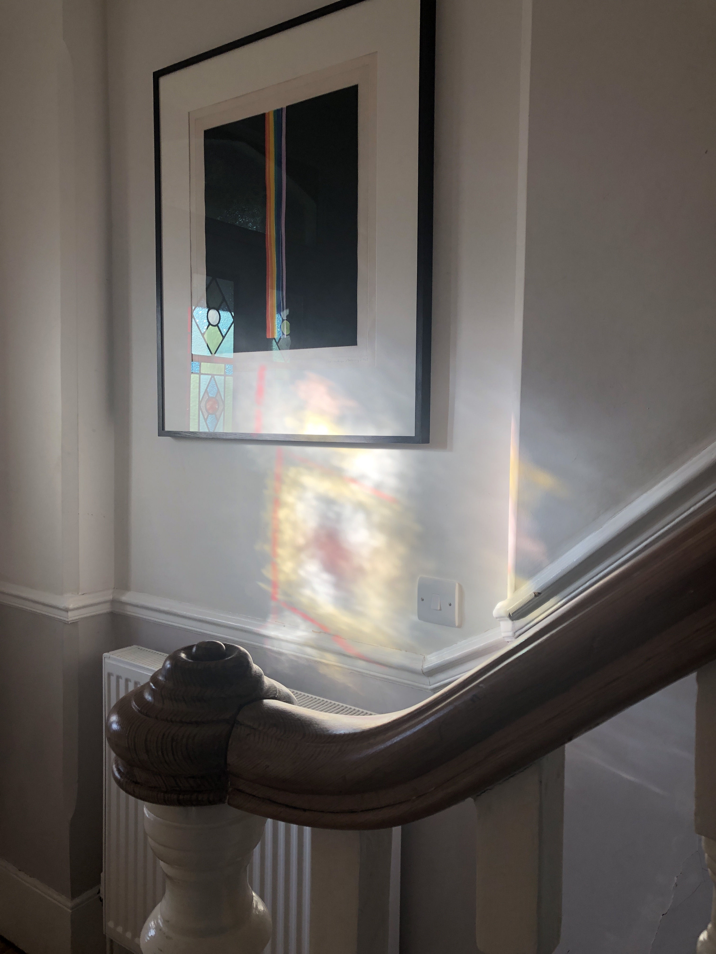
In our hallway we've hung this beautiful and unusual colour etching by Norman Ackroyd. It brings us so much pleasure as it's the first thing we see when we come home! We love the way that light through the stained glass window in our front door plays with the colours in the etching.


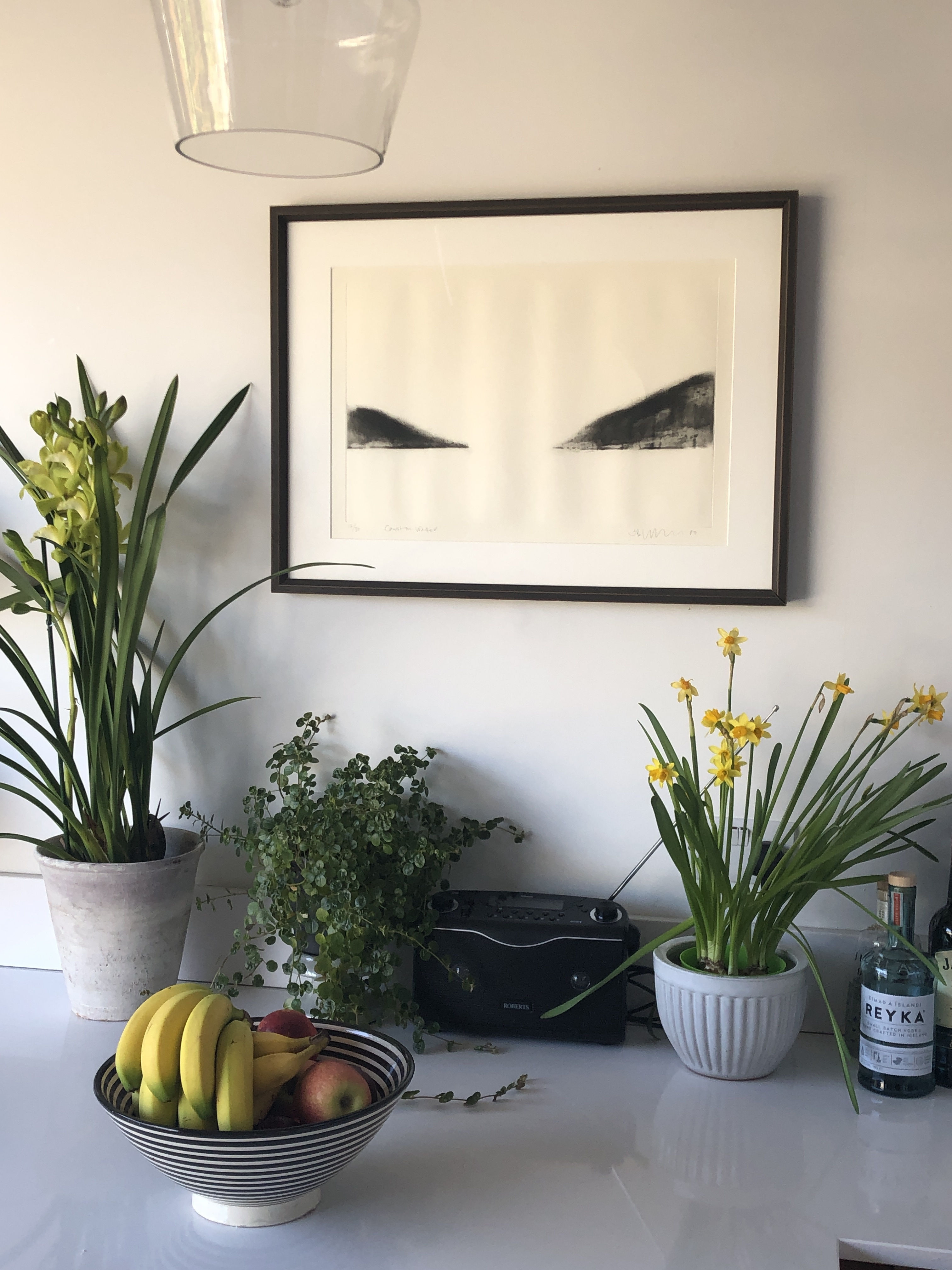
We have a very bright and light kitchen, this simple and very elegant etching by Jason Hicklin works beautifully.  We didn't know what to hang in this spot for weeks, we were trying much stronger, bold pictures, but nothing worked, then we tried this on a whim and it worked perfectly - it's one of my favourite corners of the house now. 


Caitlin Worthington

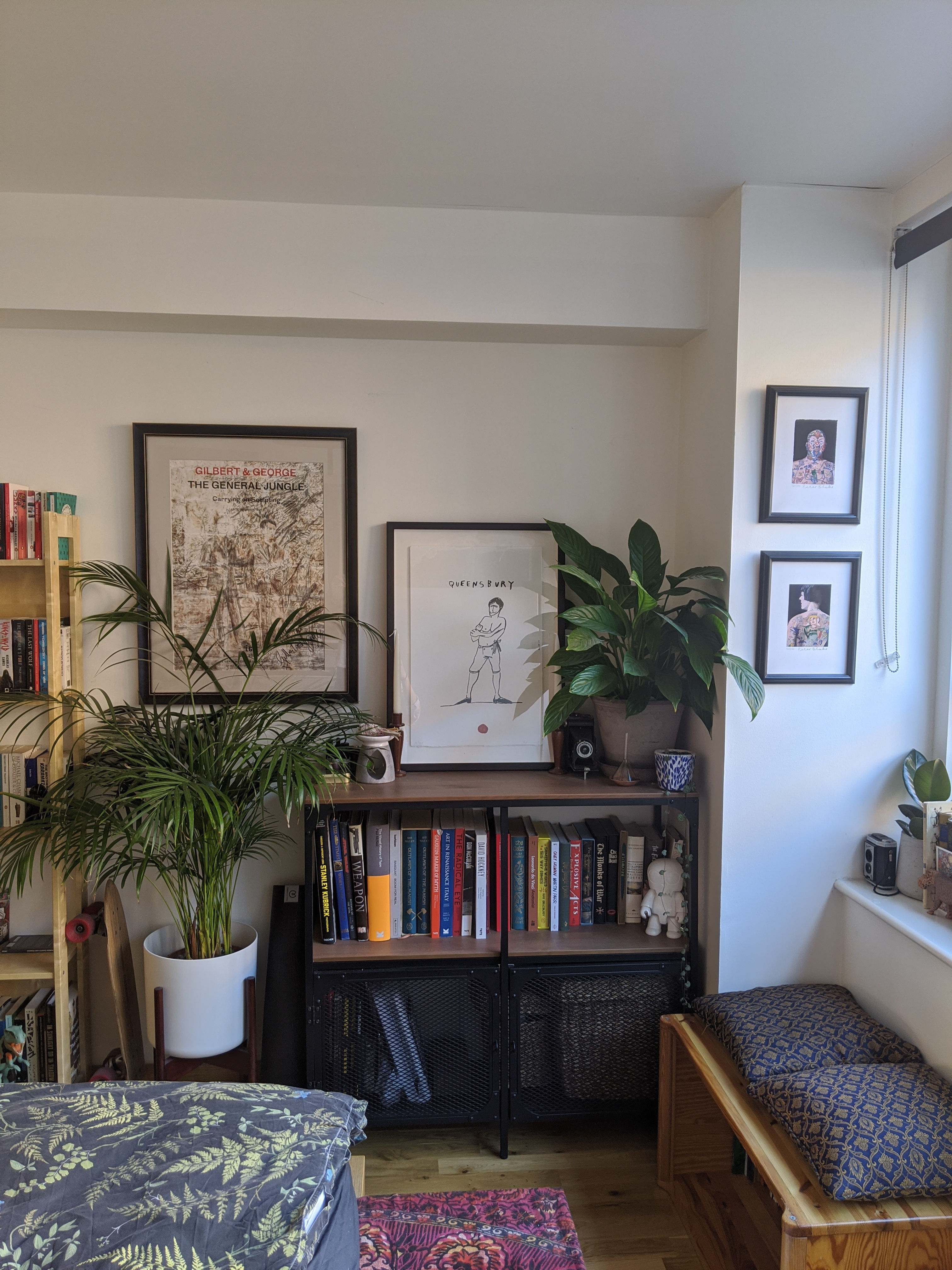
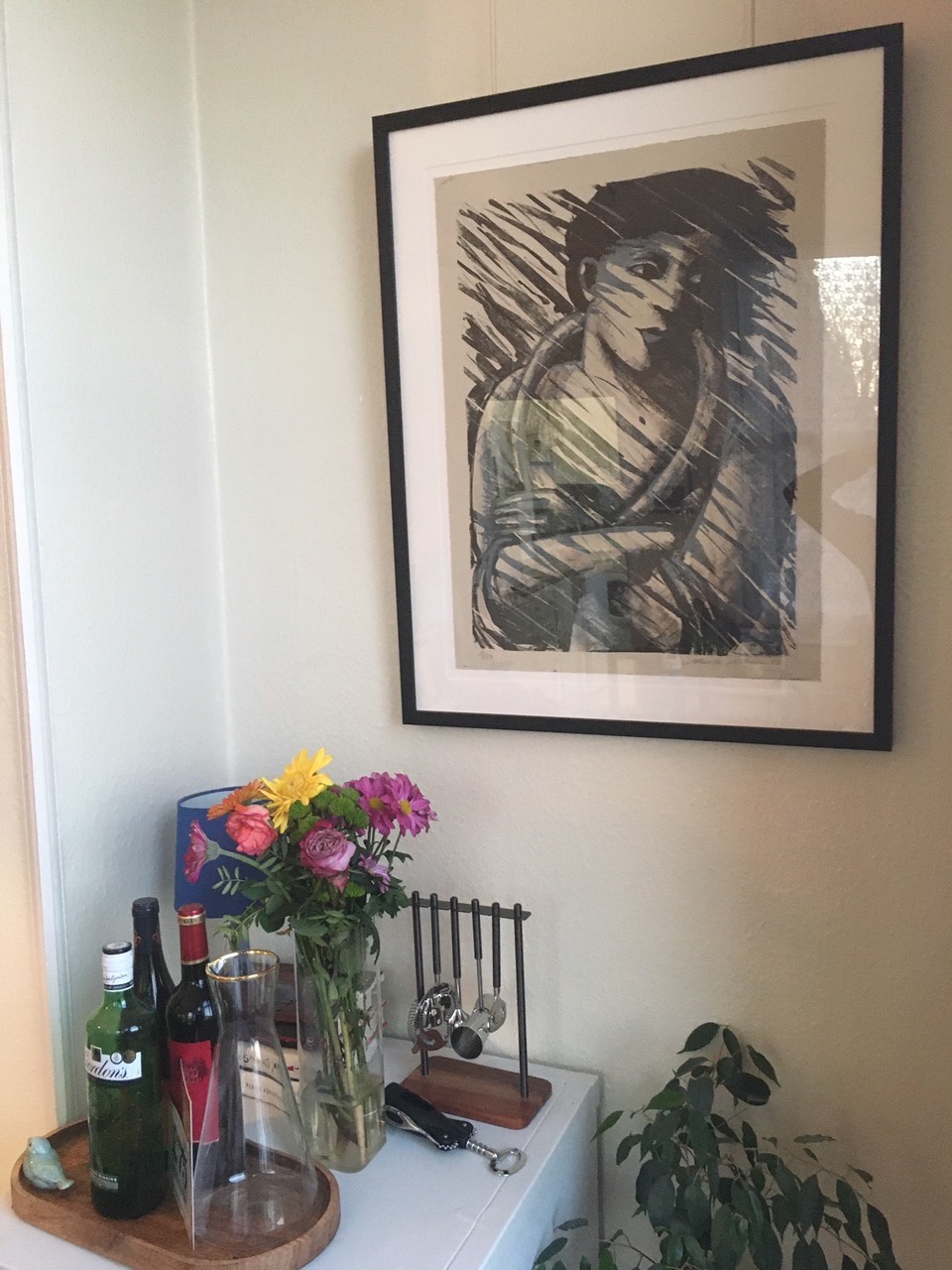
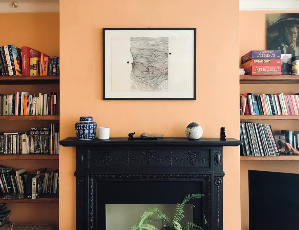
The two most important things to me when decorating my home are my art and my plants so when hanging, it's important to get these two elements working together. I'm not a big fan of symmetry and straight lines so I always try to hang or lean frames at different levels to echo the natural imperfections of the greenery. My taste leans towards monochrome so I'm always on the lookout for smaller drawings and original prints to hang together.


Daisy Macan


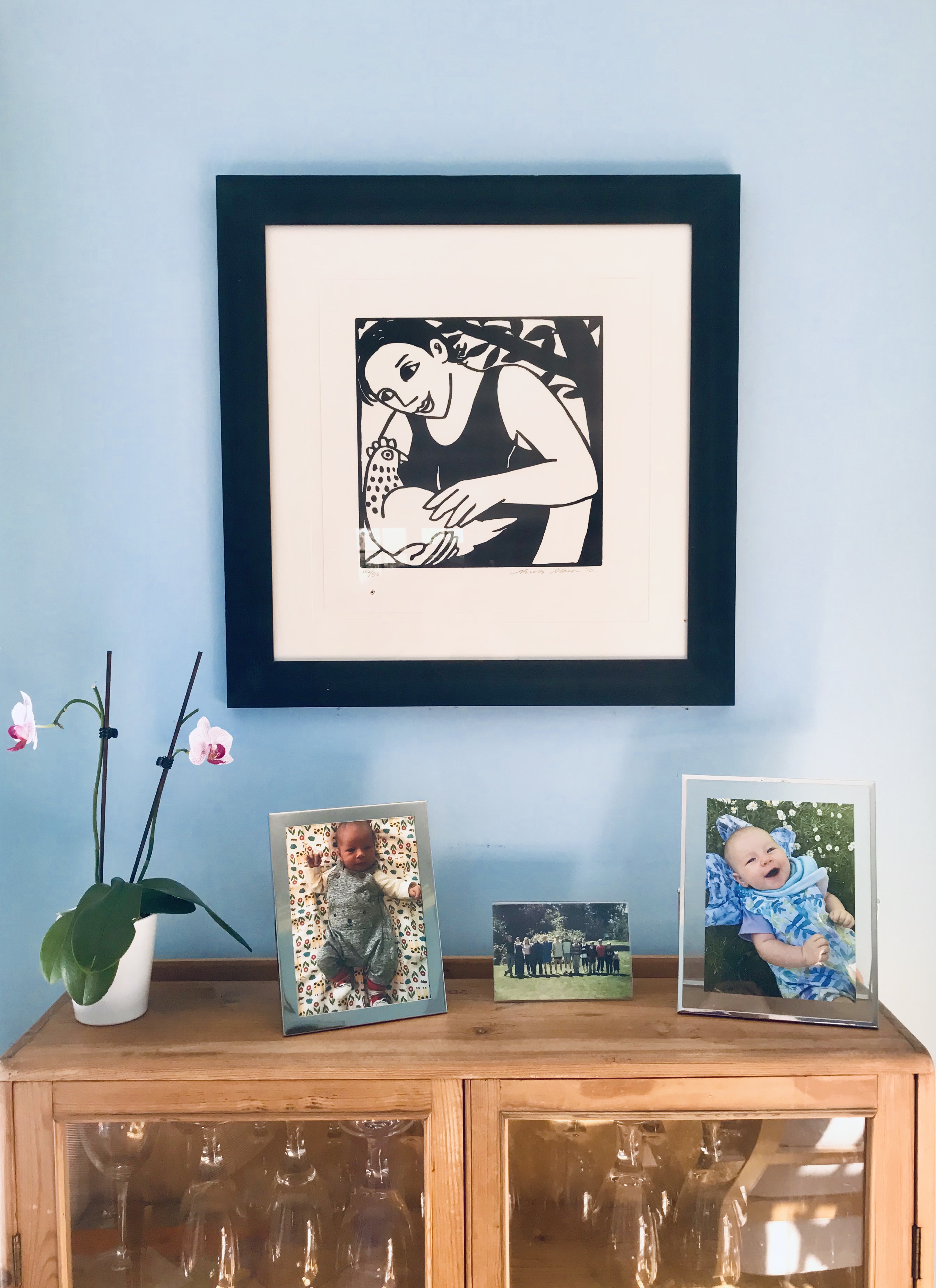
I absolutely love bright colours and the whole house is full of strong colour - not a white wall in sight. This Anita Klein woodcut is a rare black and white addition which is in our dining room. We love her work, especially her prints of birds, and think that this piece works beautifully against the blue wall. Plus, we have chickens in the garden so it was perfect, I smile every time I see it!


 Grace Hailstone


I tend to have quite an eclectic taste and also like to be in the company of art, often moving things around to be where I spend most time. Unable to hang works on the walls of our cosy, rented flat, I lean my framed works against the wall, which gives me flexibility to add other works to a cluster or move them around. I have a selection of three prints in my bedroom, which represent different forms of printmaking.
The work on the left is a digital print by Susan Collins, from her Wembury and Woolacombe series, 2015-6. It is beautifully framed by the artist in a subtle and sleek white finish, with the print floated. I have a couple of other prints for the series waiting to be framed, when I can eventually hang them all together in a group of three. 
The work in the middle is a two colour risograph print I bought online from an artist I follow on Instagram, Dunja Jankovic, in a ready made frame with the work floating between two panes of glass. I liked how the red backboard complemented the print, and ultimately, I feel a frame should complement the artwork, almost disappearing while being part of a whole at the same time.
The third print is a lithograph print from 2009 by Stanley Jones on Japanese paper. This was difficult to frame because of the delicacy of the paper. My friend and expert frame conservator, Tom Proctor, made this walnut frame for me, with silver gilding on the front edge, which will oxidise over time and darken. I love how the frame will change over time, as it lives and breathes, it suits this monochrome work. The backboard is hand coloured with a watercolour wash on archival card and the print is floated so the edges of the paper are visible. Hopefully I will be able to hang these in their own environments later on, but I enjoy looking at them every day in their little cluster.
 
Christy Slobogin and Oliver Pickford
Oliver and I have quite a few works by Eames Fine Art artists hanging in our home. The pieces that we've included below are all of different printmaking techniques: etching, monotype, lithograph, and linocut. They all have their own stories behind how or why we acquired the works, and they bring us so much happiness, especially now that we're spending so much time inside our flat!
 
One of our favourite pieces is London Lives - Clapham Old Town, an etching by Karen Keogh. It's hanging in our bedroom above a mantelpiece, where the architectural lines of the buildings within the piece play really well with the structural features of the mantelpiece and fireplace. I cheekily bought this work for Oliver for a birthday a few years ago, knowing that we were moving in together several months later and that it would soon be on my own wall!
The piece that steals the show in our living room is Sophie Layton's Still Life VI. I've been obsessed with this work since I first saw it in the Eames Fine Art studio and walking in to see it in our home every day still brings me such joy. My favourite thing about this work is the way that Sophie paradoxically uses negative space to convey objects' solidity. And Oliver loves the confluence of the colours - in some places the shades are starkly defined against one another and in others the colours fade into one another in pastel penumbras.
We've strategically placed Anita Klein's gorgeous lithograph The Storm near our living room windows so that it appears that the figure is gazing out to the world below. I get a rush of satisfaction whenever it rains and I see the figure's face looking out at the storm outside while she's stuck in her own inside the artwork. 


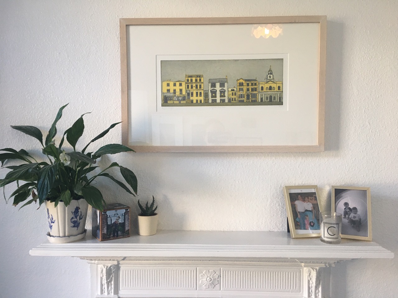
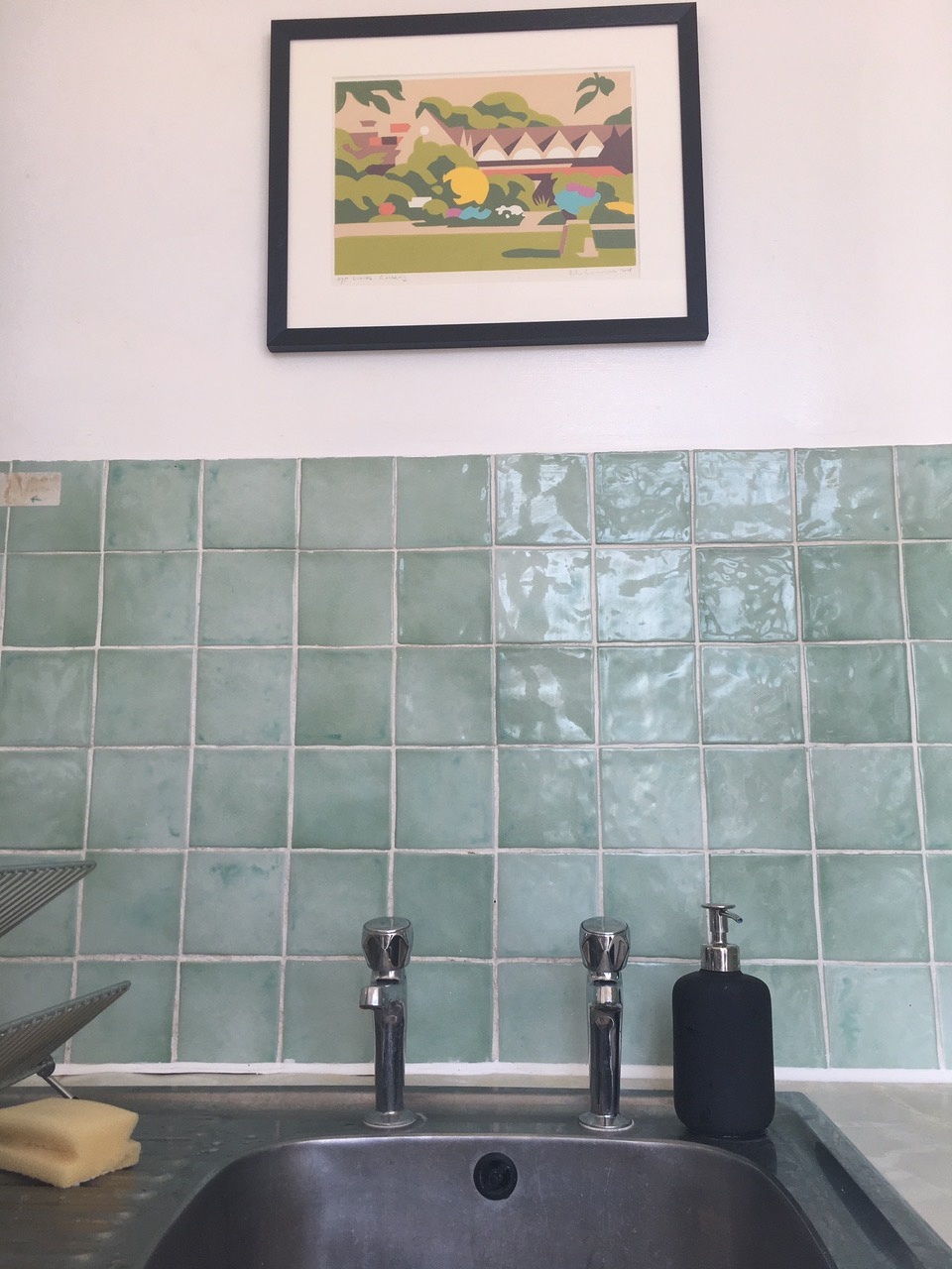
And finally, we absolutely adore our Paul Catherall Watts Gallery linocut. It's hanging above our sink in our kitchen, where the backsplash picks up the greens exuberantly placed in Paul's composition. Oliver actually bought this work from an Eames Fine Art auction several years ago as a gift to his father for his 80th birthday. Unfortunately - or perhaps, fortunately? - we miscalculated his dad's age (embarrassing!) and now it's hanging in our house for several more years until the big birthday rolls around. So not only do we get pleasure from the beautiful image and the reference to one of our favourite art galleries, but we also look at it as a humourous piece because of the family story behind it.

 
Rebecca Holmes and Tom Clatworthy
Since we have been working from home, we decided to have a little rehang of our artworks. I know... we just can't stop! I guess we have missed installing the exhibitons haha! Here are a few artworks we have collected over the years. We love them and have tried to put them in places which go with our colourful home.
 
 
Artwork number one is our favourite. 'The Image In Search of Itself' by Victor Pasmore is in our living room in pride of place above our mantle piece. Looking at the chaotic scene around this work - I think we chose to hang it here to provide a bit of calm!  Pasmore's art is stunning and we are always really tempted to bid on them in our auctions.
 
 
In our hallway we have a beautiful blue reduction linocut called 'Sea Serpents' by Julia Gittins, we love the composition of the piece and the intricate details which are perfectly lined up throughout all of the layers. On the right is one of my polymer etchings Two Moons. We tried to make the pictures and the space work with each other and I think it flows quite nicely!
 
 
We have a lot of plants and they are also a massive part of our home and at present, Big Ian has nearly eclipsed our Nigel Swift print. This was one of the first prints we bought and we love it! It is in our kitchen, funnily enough, the moon does shine on this wall at night!
 
 
Finally, we have Anita Klein 'Picking Lemons'...and our cat Babu who was not amused when I disturbed her. We chose to put Anita's work in our bedroom (it used to be in our hallway). Anita's work always makes us smile and where better to have a work like that than in the room where you wake up in the morning! 


About the author

Rebecca Eames

Comments

This is a terrific idea: thank you for sharing! I have that same moon etching by Nigel Swift and several prints by Anita Klein in my house, too, so interesting to see h ow others exhibit them. But the revelation is that very unusual one by Norman Ackroyd in your own home, really interesting. That's your advantage - to find such treasures.
Can't wait to be able to get out and look at art again!

Ruth Dar
28 April 2020

Echoing all previous comments - how lovely! Thank you!

Jean Hughes Bell
24 April 2020

Loved it. Beautiful pictures in real homes. So different from what you see in glossy "lifestyle" mags!

Ros Clayton
22 April 2020

Thank you for giving us a glimpse inside your homes. Fascinating and inspiring. We need to repaint our walls, and buy more art!

Andy Hayes
12 April 2020

Loved this. Inspired me to rehang my pictures and perhaps make room for something new when this is over. Thanks

Marcelle de Sousa
9 April 2020

Brilliant idea! Inventive, fun, and inspiring too. We look at our two Anita Klein even more than usual, but also postcards and exhibition catalogues and posters...

Marianne
9 April 2020

Add a comment